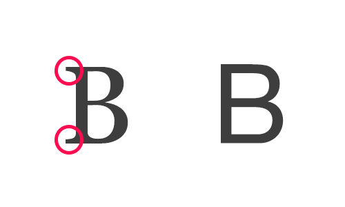
Stenciling is not only a technique exclusive for labeling stuff owned by companies, government, military, and utility services providers. Dating back to several years ago, this method of imprinting letters and images has now been incorporated in arts and crafts, as well as in-home decoration. It is a great way to unleash your inner creativity while relieving stress.
With a multitude of fonts everywhere, it is challenging and overwhelming to pick the best one for your project. Whether the font will be used for formal business purposes or a simple hobby, the font choice is a crucial part of ensuring the success of the outcome. This article will not only give you tips on how to choose the most suitable stencil font for you, but also some insights on the typeface families where stencil fonts originated.
The factors to consider in choosing the right font
You can narrow down your font choices by considering the following factors:
1) Consider the signature trait of the brand
The font that you will be choosing should reflect the branding or the signature trait of your project. In the first instance, someone else looks at your font, the spirit that you wanted to convey should resonate. Just like people, every stencil font has a unique personality or aura around them.
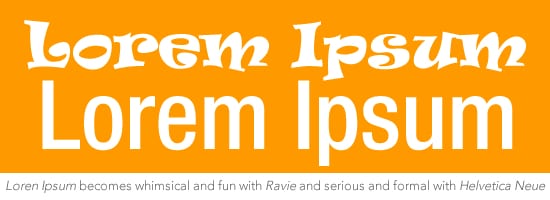
Take below as an example. The font used above is Ravie, while the one below is Helvetica Neue. Ravie gives off a whimsical and more playful vibe at first glance, while Helvetica Neue gives more of a serious, formal, or business-like aura.
You wouldn’t use Ravie as a stencil font in a military tank, just like how Helvetica Neue is something you cannot use for a little girl’s fairy tale birthday party. The content and the people that you are targeting should also be included in the appropriation.
2) Readability of the stencil font
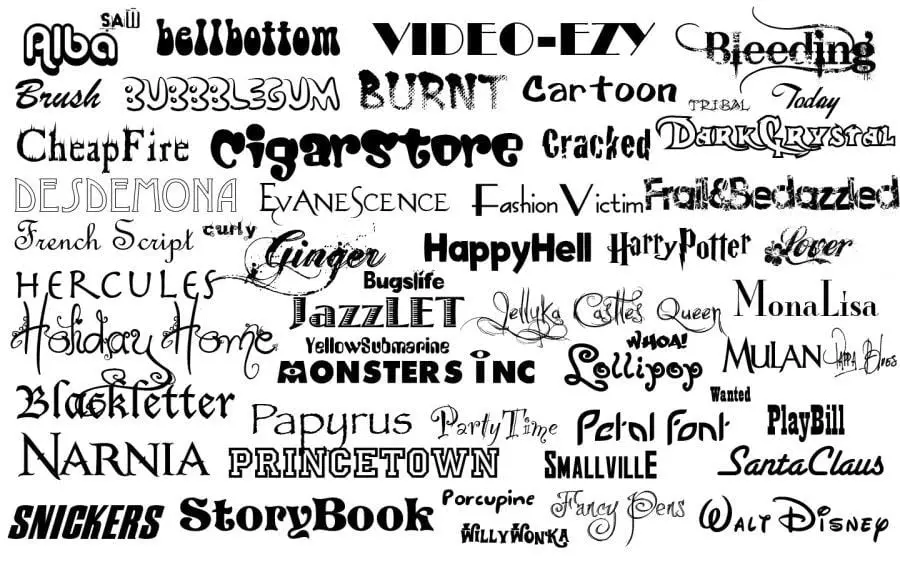
Your chosen font should be creative but also clear and neat at the same time. While it is fun to use whimsical fonts, some of your target readers may not find them appealing, especially if it overshadows the message that you are trying to send. Most of the time, older people and individuals with bad eyesight will overlook your work. You cannot use all fonts on the sample above is just one project as it will look messy.
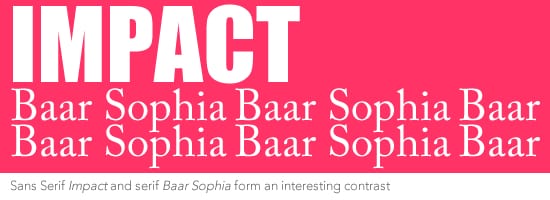
Readability does not mean that you cannot play around with different font types. You can combine them with several techniques. One is by utilizing fonts that match or contrast each other. A great example is Impact and Baar Sophia above. They form a great contrast without outshining one another. Their contrast makes them match as well. You should refrain from using a font that is completely similar to other, to the point that you can no longer differentiate which is which. It will also cause distraction on your audience’s end, as their attention from the message will be shifted to comparing the fonts you’ve used.
3) Differentiating Sans from Serif stencil font type
In considering the demographics of your target audience, knowing the difference between Sans and Serif stencil font type will greatly help your work.
Serif is more recommended for long messages. Due to its pointy ends, it has a bit of psychological effect, which helps the eyes navigate through lines. Sans is more advisable for shorter messages, from one word up to phrases. This also applies to all stencil fonts under the Sans and Serif family.
In terms of demographics, Sans can attract children more, while Serif attracts adults. Sans are usually utilized for storybooks, while Serif can be seen on some marketing brochures, which are usually given to working adults. It is also more in an old school type.
Being able to differentiate the two will enable help you to target not only readability, purpose, audience type, but also familiarity and the ability to discern other fonts.
4) Font Family
After mastering the difference between Sans and Serif, you will slowly become familiar with other fonts under the same families. Back in the early 16th century, when the stencil was first created, there were no font families, as Romans and italics are the only choices back then. Roman and Italics are much like our Sans and Serifs. Developments, such as mixing and matching fonts with each other, just occurred around the 1700s. This gave birth to font families. Getting to know these font families will help you organize your frequently used fonts as you start to accumulate more.
A) Modern Type Font Family
Italics and Roman are the only choices before. Weight and proportions were never a big deal, which are factors that play a big part in stenciling. In line with this, the modern Type Font Family was created by Morris Fuller Benton. In the late 19th and early 20th centuries, Benton is the director of typeface development of American Type Founders. The Modern Type Font Family includes condensed, expanded, and outlined versions of parent fonts. His works include Cheltenham, Stymie, Century, and Cloister.
B) Numbers Font Family
This font family was created around 1957 by Adrian Frutiger, who was a Swiss designer. He finds the labeling “condensed,” “expanded,” and “outlined” vague, so he came up with this system. The first number indicates the weight, where three is the lightest and nine being the heaviest. The second digit is the proportion. A higher number means condensed, while lower ones mean the font is more on the expanded side. Moreover, if the second number is odd, it is under the roman font style. Even numbers meant it is under the italic family.
C) Extended family
As you can infer from the family name itself, it is more on the extended side. Like a typical extended family with a sweet grandma in the household, this font family is made of two or more families, but sharing the same height, weight, and proportions.
D) Size-specific family
This is a family type with a multitude of designs with varying sizes. It is also more numerical. Its variants consist of 6, 12, and 72. These variants are the ideal sizes that these fonts should be set for maximum readability.
5) Limit the total number of stencil fonts in one project
The ideal font number in a project should be two matching and contrasting fonts. You should refrain from using more than two as much as possible. Any font should not outshine the other one, unless intended, such as in the case of newspaper headlines.
Stenciling is not only about imprinting words and phrases on surfaces. It is a type of art dating centuries ago. Simply having a list of available fonts won’t do. Knowing the history will greatly help you in deciding what stencil font to use. Being knowledgeable with the basics will open more stenciling techniques, and who knows? A simple hobby can turn into a profitable business for you in the future.
